Designers, Design, New Languages,
Theory and the New Aesthetic
The Effect of Globalisation on Design
I found the guest lectures interesting to hear different views on the effects of globalisation on design and design practice.
Simon Manchipp from Someone, felt people saw globalisation in a negative way with some believing it leads to homogenised design. He doesn’t find this the case at all and for him it has ‘led to greater collaboration…with bigger ideas and a bigger canvas’. Working with different cultures can bring about a different way of thinking.
Although, technology gives us greater connectivity more easily, Sam Winston prefers to travel to work effectively and experience things first hand, ‘people respond to other people, you still need to connect.’
Sam Winston often works with a publisher on picture books and the books are printed in China. His last project was printed in 23 different languages all over the world, so very much tied to a global economy. This does affect the way he works as he was asked to separate text and image so there would be only one plate change for each language, which saves hundreds of thousands. So, it affects design decisions from an economical point of view. He tries to push away from this as it often means the last 500 books have been made like that, but as a creative you always ask how can I make a book that looks different? If it weren’t for designers pushing their ideas and their design, this way of working would inevitably lead to homogenised design.
In the resource film, 'Drawn Here (and There) by Non Format', it explores the role of the designer in a global context.
The two halves of Non Format, Kjell Ekhorn and John Forss, formed a creative partnership around 1999 and established a business in London in 2001. They started out with work for The Wire magazine before branching into fashion, music and publishing clientele. Their work is a fusion between type and image and has been highly influential often being defined as the look and feel of graphic design at turn of millennium. They have accrued many awards for their work.
Images: http://non-format.com/ (Oct 2022)

Images: Drawn Here (and There), 2010.
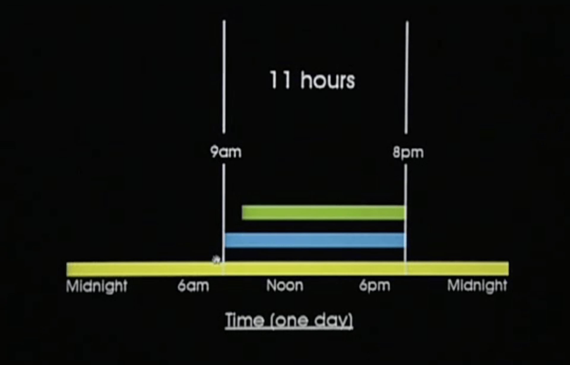
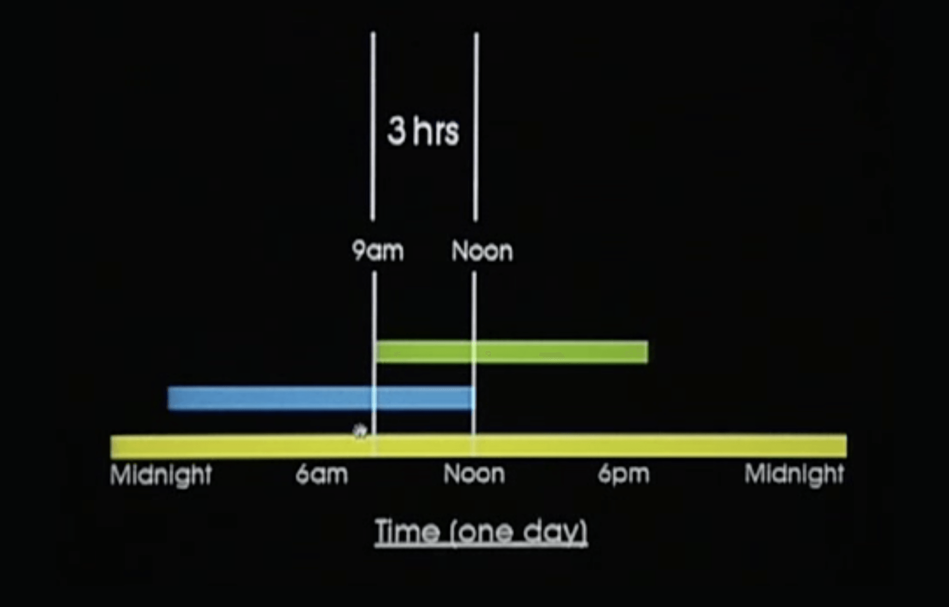
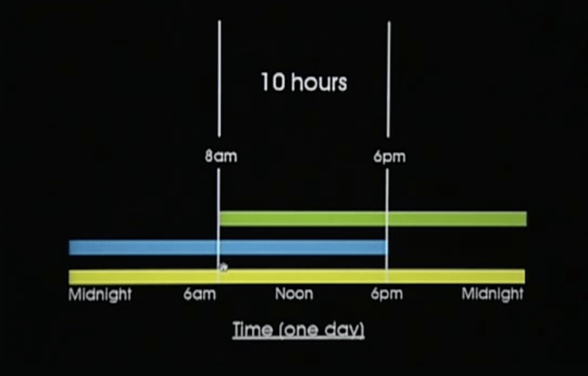
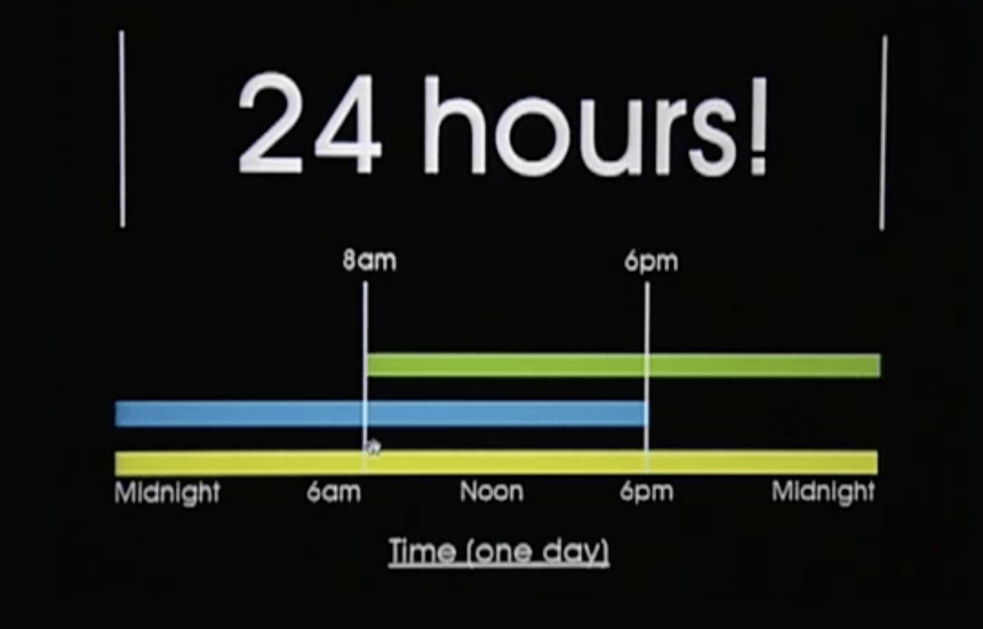
The charts above show how the duo working across time zones has increased how long the office is actually open for each working day. From left: London hours, London/USA hours, London/USA overlap, Norway/USA extended hours, potential for 24HRS!
Image 3 shows how much the pairs hours overlapped when they worked between London and USA where they could catch up and discuss work; and image 4 shows how this overlap was increased further with a change of time zones and both working a few extra hours.
They have clients all over the world and communicate mainly by Skype and email and have found it does not matter where they are in the world they can still work and collaborate together. They have calculated that the office could be manned 24hrs a day across time zones and the pair could also be working simultaneously for just as long as when they both worked in London together!
Globalisation, technology and remote working has allowed people to move anywhere in the world and work seamlessly, so no-one would actually know where you were working from!
Task 1: D&AD Award Winners 2022 Synopsis
Explore the categories of the D&AD award winners 2022 and consider how this impacts on your views of design terminology, consider the overlaps and points of change, difference and similarity.
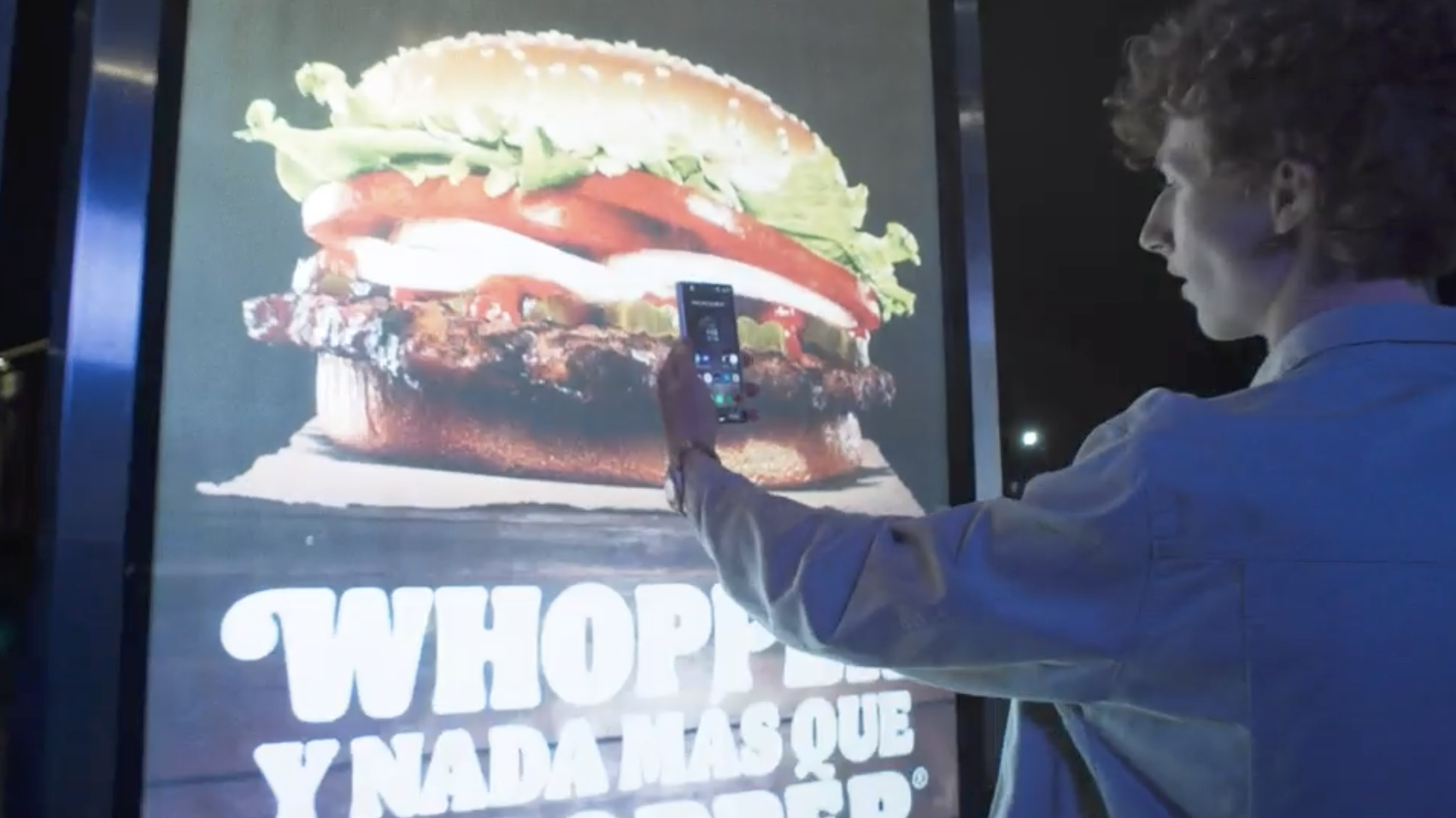
I haven’t looked at the D&AD awards since studying for my BA some decades ago and it seems to have grown significantly. There are a whopping 40 categories not to mention subcategories for each. On looking through these I noticed that there were many projects entered into several categories and had either been short-listed or won across many. The most notable was the Burger King Whopper Heist, which won seven awards and was short-listed for a further two; this was across 5 categories for one campaign. This alone demonstrates the overlap between categories and disciplines. However, it also enforces that there are many design practices that are multidisciplinary, working collaboratively across disciplines and can therefore offer clients campaigns or solutions that integrate across many platforms. Collaboration and changing technologies enables boundaries to be overlapped or even broken to create whole new realms or subcategories.

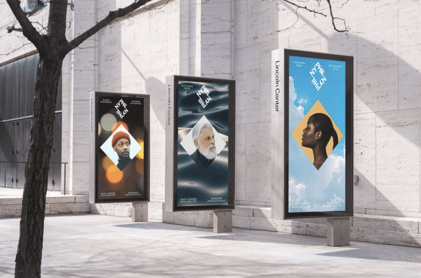
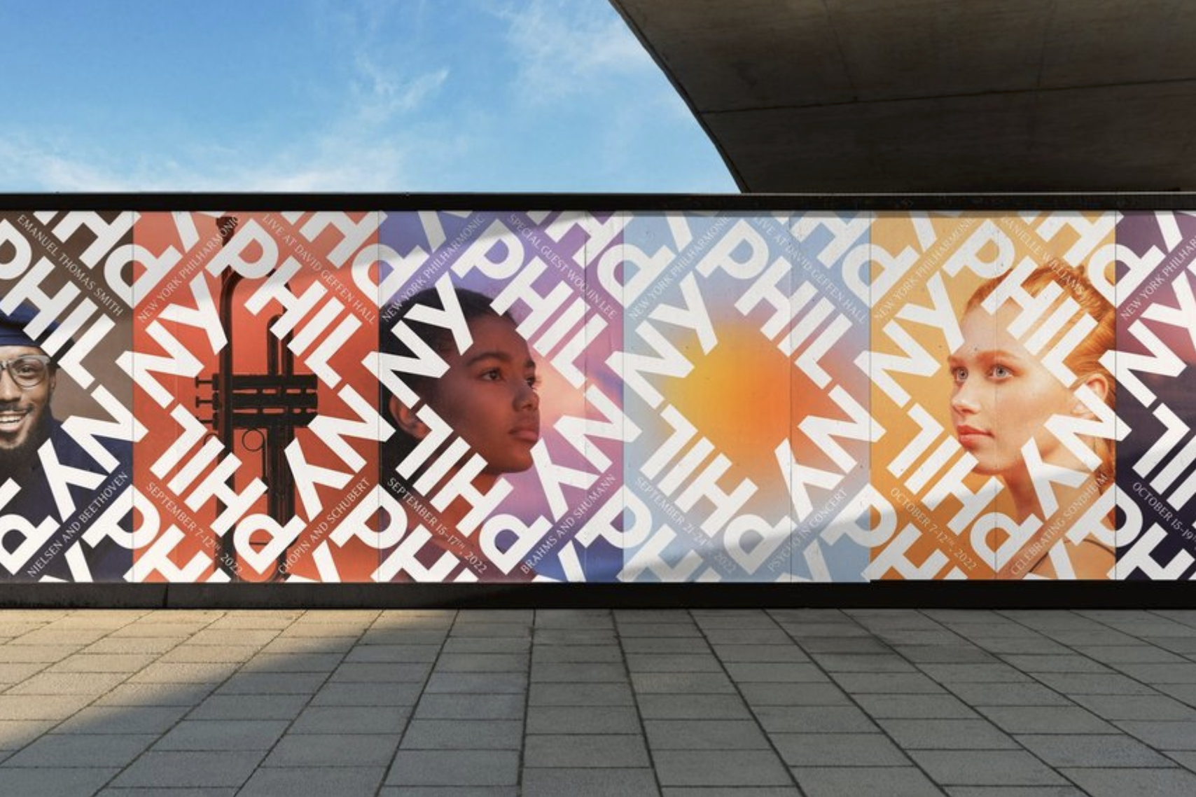
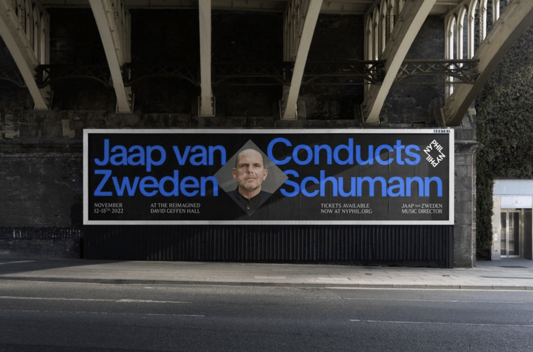
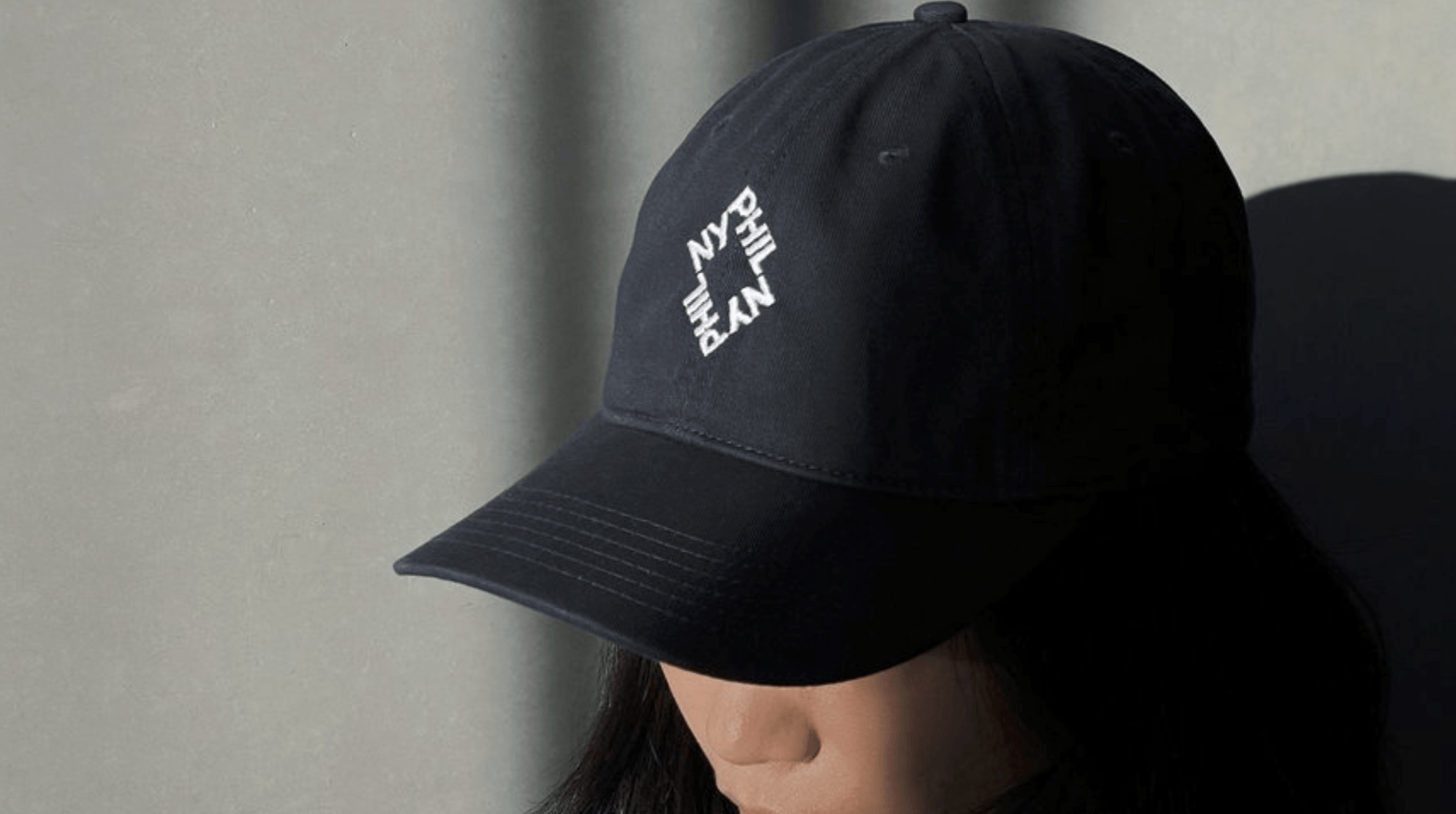
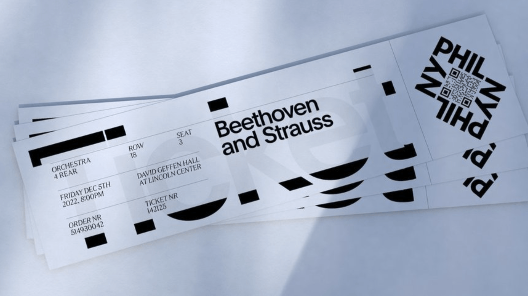
One submission stood out in the Graphic Design category was the NYPhil submission (I love the use of typography). This crosses both graphic design and typography categories and therefore there is a crossover in subcategories including integrated and logo. Yet, this term ‘integrated’ encompasses multiple categories of design, so the list could be much longer. However, this type of work increases its reach to a wider and much broader audience and subsequently more success for the client and arguably more chances for awards in some cases.
There are so many overlaps and similarities, yet huge differences between some categories of design and I think the D&AD are making the best of a very difficult job in categorising them.
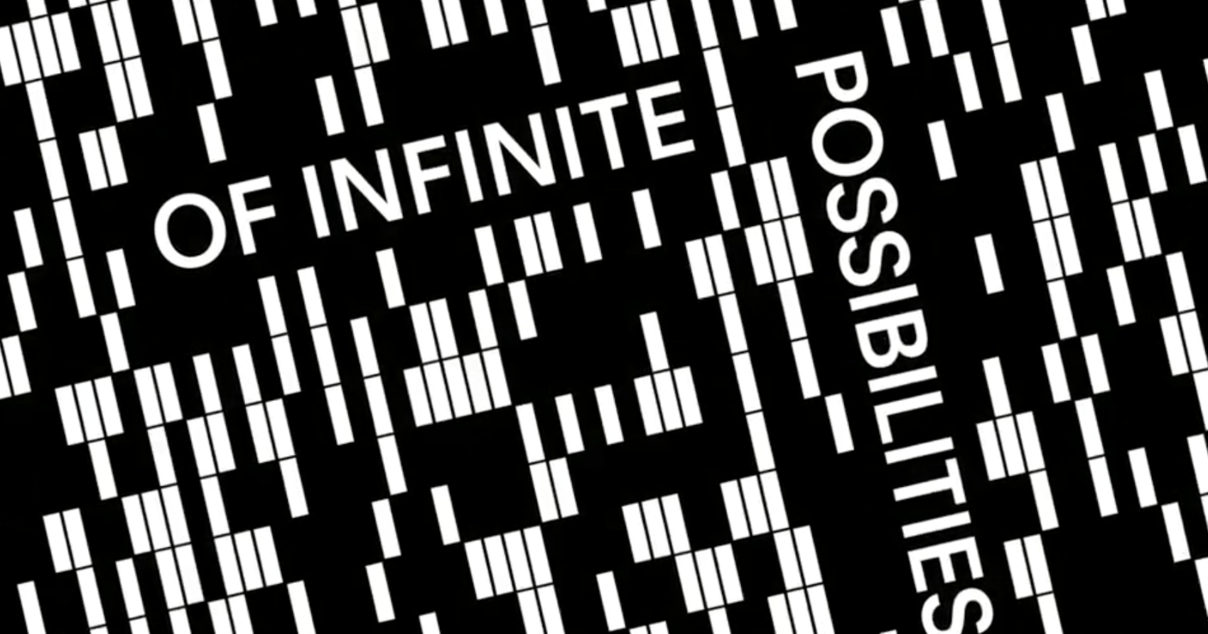
Historically examples of design would be covered by the more traditional category of ‘print’, but now this has been taken over by the infinite possibilities of ‘digital’. Amongst the submissions for this years D&AD I noticed the use of moving image, animation and video seems to have become the trend. Maybe to engage us for longer. In all, design will continue to grow and evolve with the adage of new technologies and continual development.
Below are some of the applications for the NYPhil new identity which as the short film accompanying the work suggests it has ‘infinite possibilities’ including moving image!


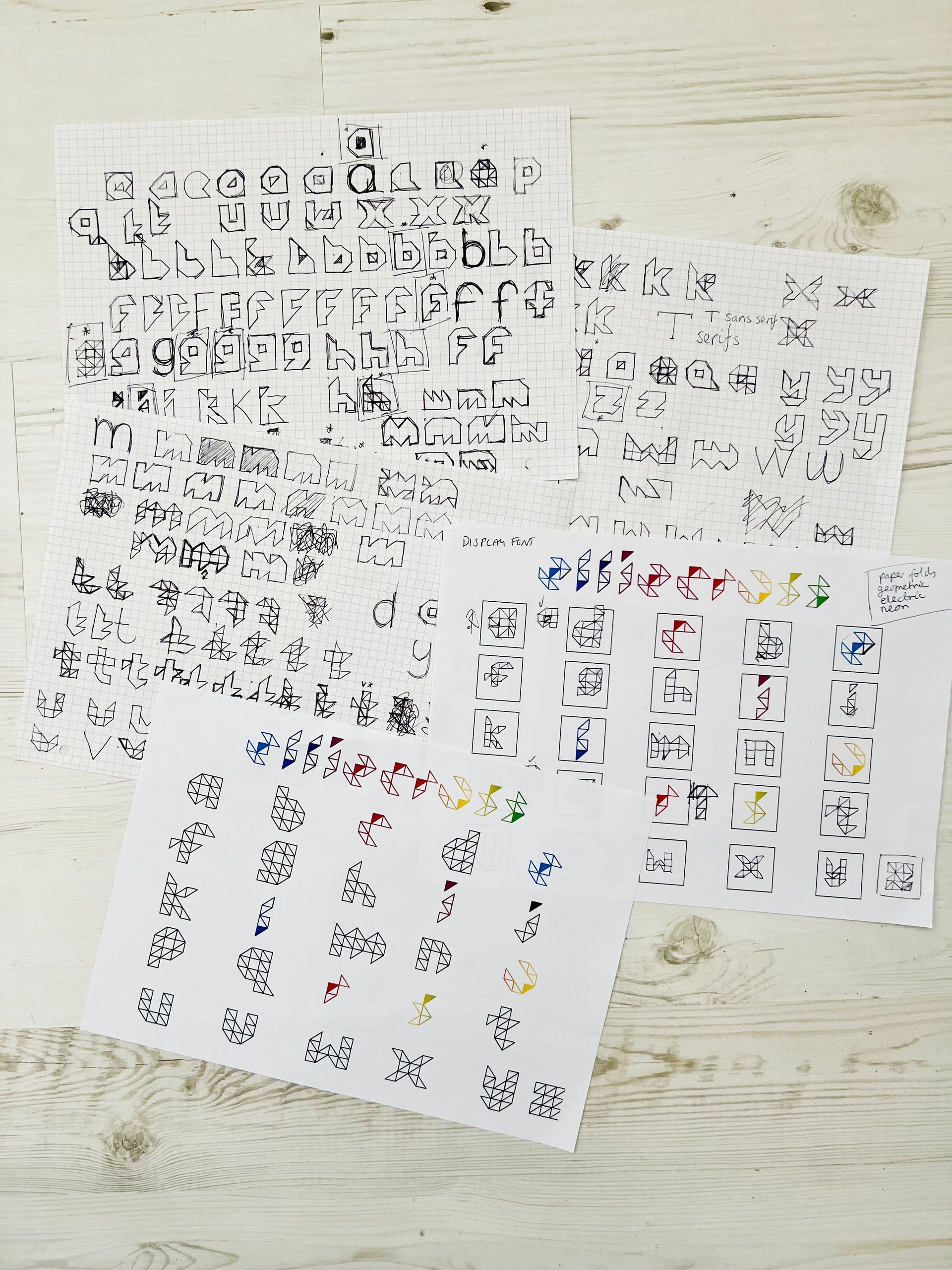
Task 2: Breaking the Boundaries of Graphic Design
- Branding
- Editorial design
- Book design
- Web design
- Type design
- Logo design
- Illustration
- Packaging design
- Animation
- Interactive design
Choose a piece of design that breaks definitions of design practice and write a paragraph describing this practice. Come up with a new term that describes this area of work.
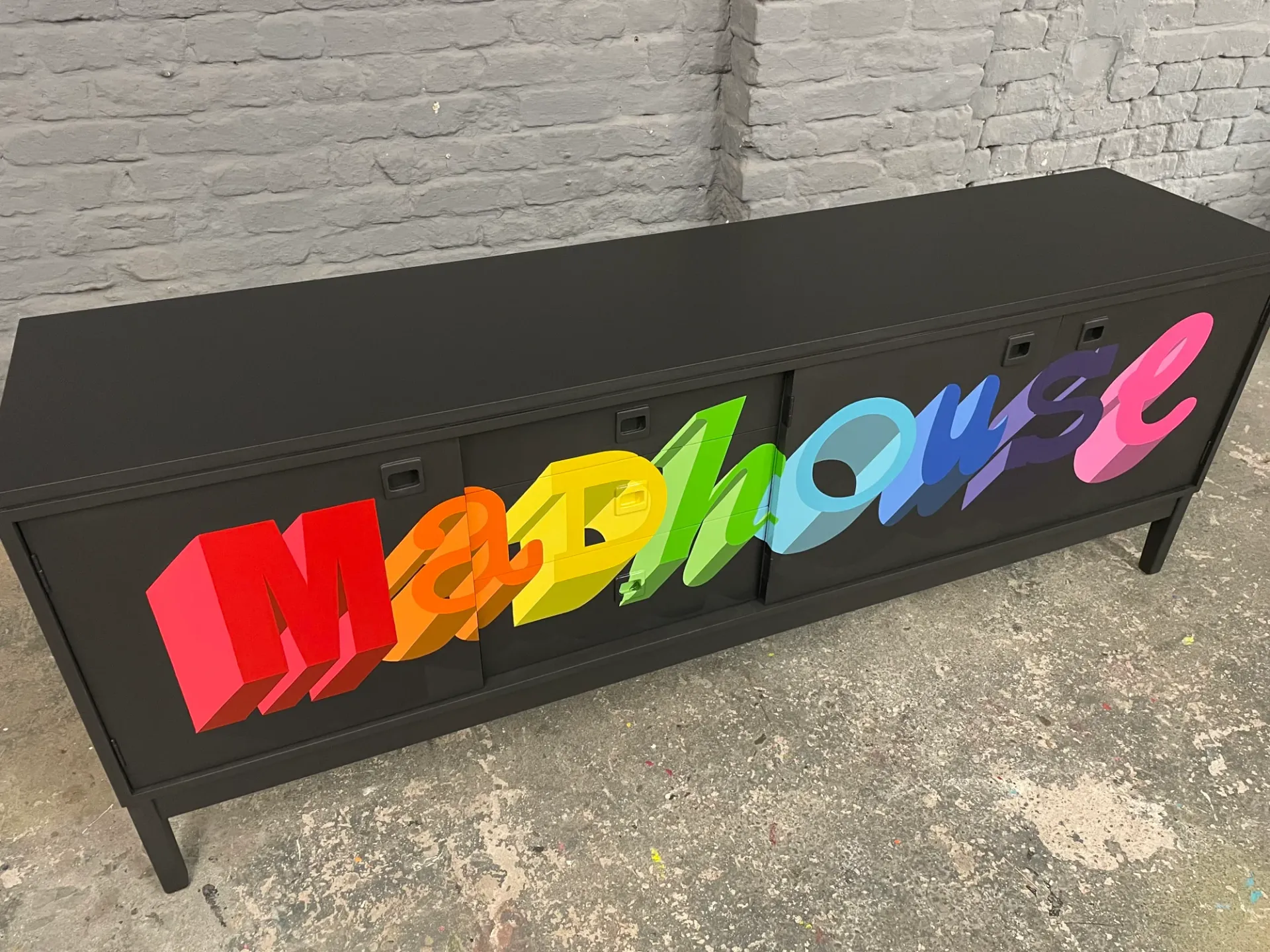
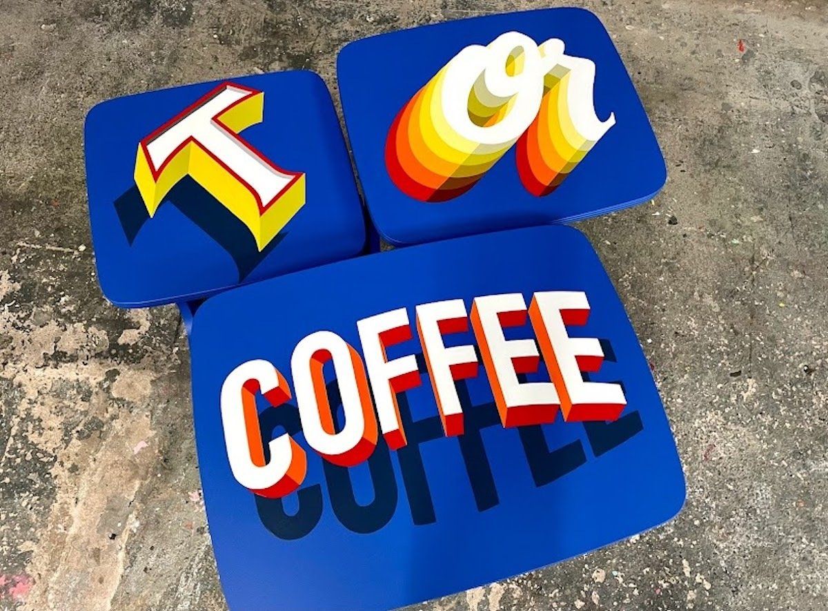
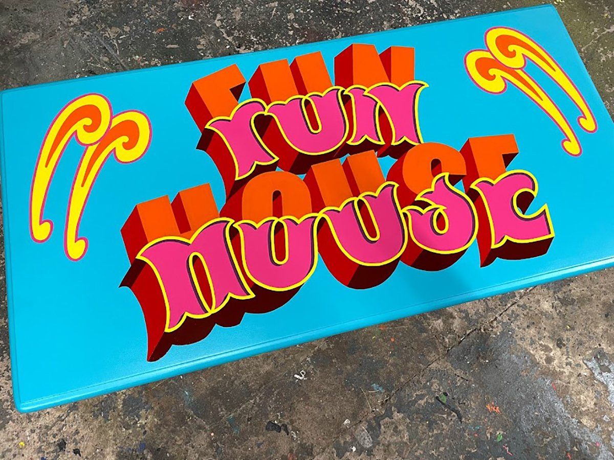
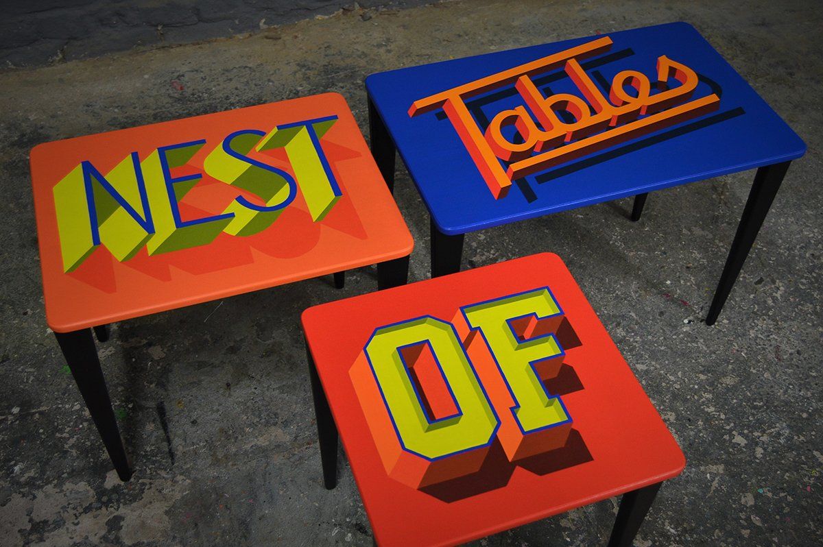
Meet Furnitype! I first came across the work of Joel Poole by accident when my mum was watching the BBC series, Money for Nothing, and his work instantly grabbed my eye by its bold, bright and vibrant style, plus my own love of mid-century furniture.
In an interview on Type 01, Joel describes his work as traditional sign writing meets pop art, street art, graphic design and whatever else takes his fancy. He is an escapee of corporate life, and began restoring vintage furniture before coming across sign writing and work by the likes of Joby Carter, Dapper signs, Ben Eine to name a few.
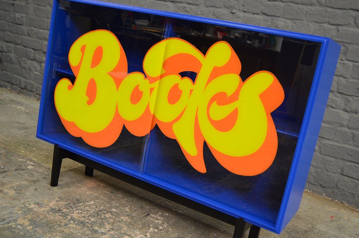
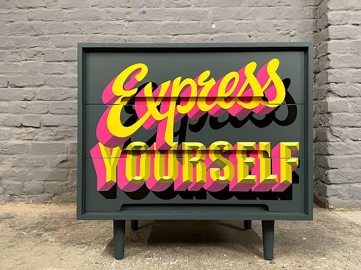
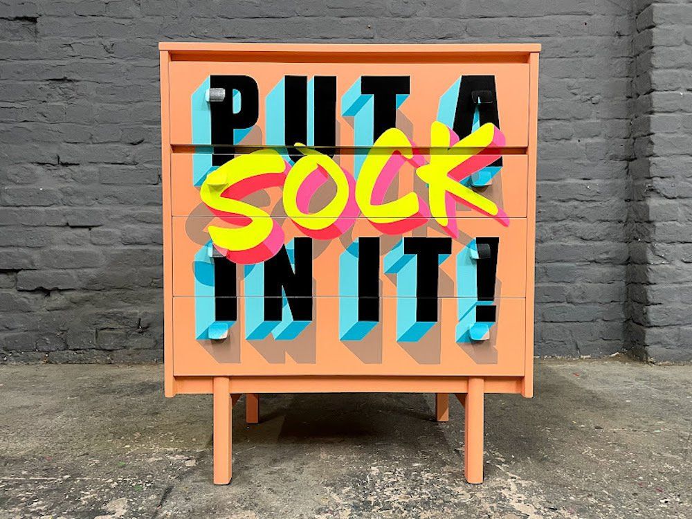
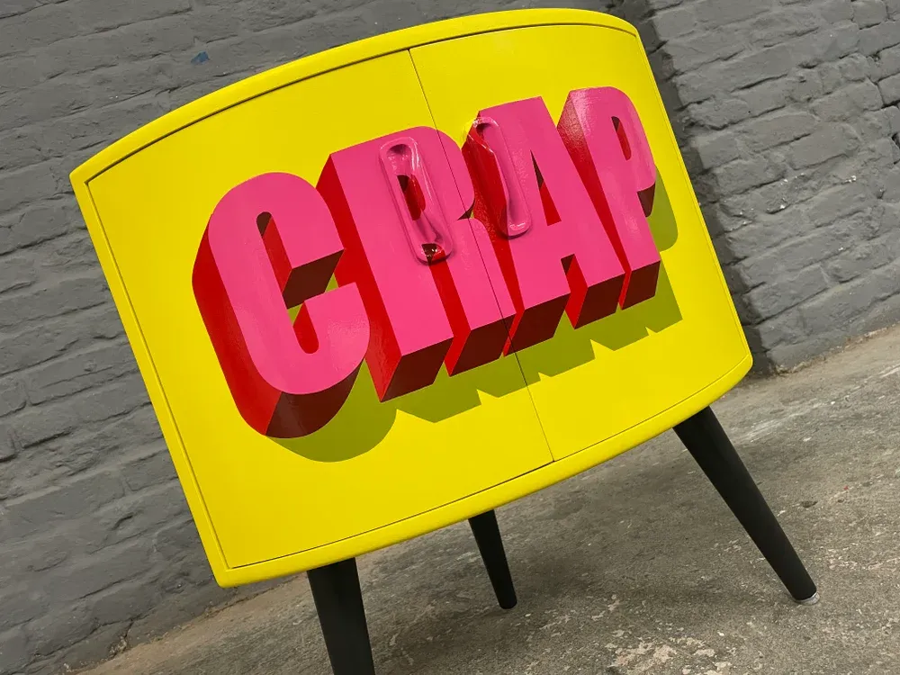
Images: type-01.com (Oct 2022)
I love this combination covering lots of my own likes, mid-century furniture, sign writing, vibrant colour and upcycling! I too have turned my hand at upcycling my own furniture in the past by adding colour, but I think I need to push my own boundaries!
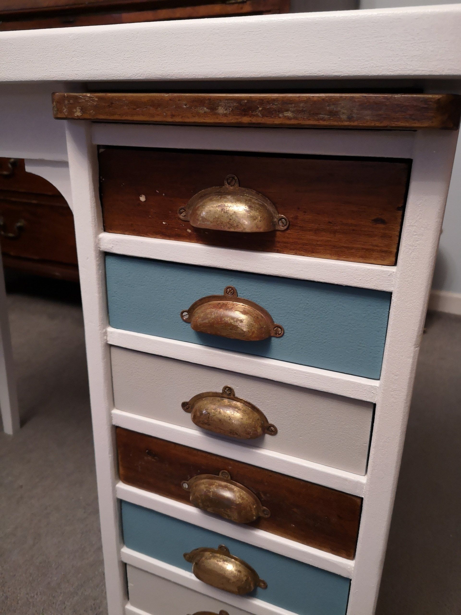

Images: elliecross (April 2020)
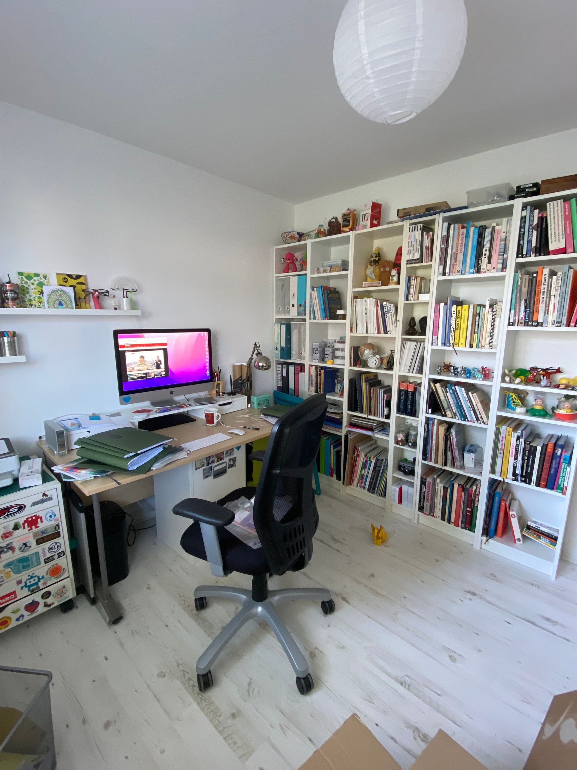
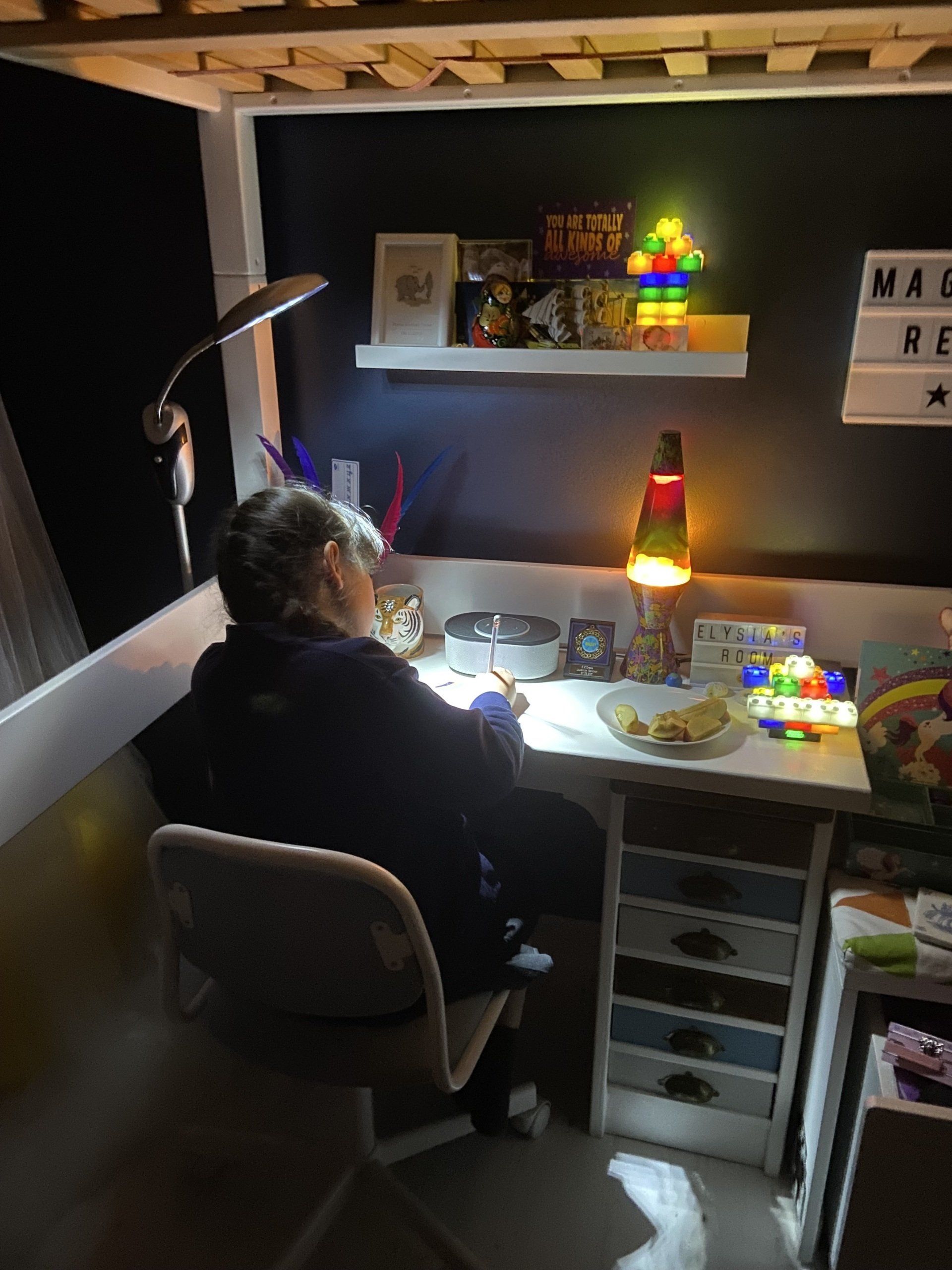
My daughter required a desk to complete her home-schooling during lockdown, so I renovated this desk that my great grandad had made for my mother when she was little. Originally it was painted white and had so many layers of paint from over the years. I stripped it back to bare wood and decided to leave some of the exposed wood like a window into the past and to see the grain that my great grandad would have also touched and worked on. I have a fondness for distressed textures and surfaces, so to see this through all its stages was a delight and to keep some of these gives the piece a little more character. Hopefully my great grandad would have approved!